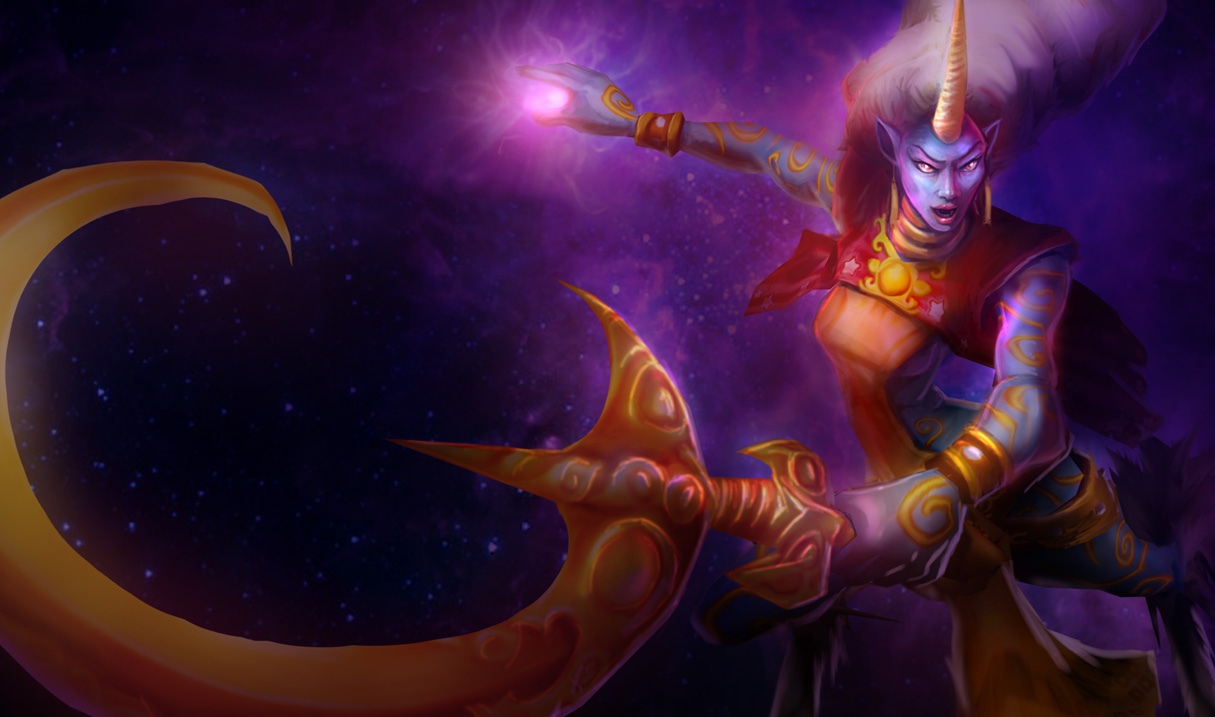
Ignore that horrifying monstrosity above, that's just Soraka's original splash art.
Now, I haven't posted in a longer while than I usually do, and I know you all missed me very dearly, OBVIOUSLY. I've been semi-absent because I've been hopelessly addicted to Final Fantasy XIV. Thanks ADAM, (Here's his article by the way, it's great.) now I have a new obsession to take over my existence. Now where was I? Oh yes, the list.
Now, since my last post was the BEST skins, I figured it was only natural to follow-up with an article about the WORST skins. Now, Riot has some great artists and designers. Nevertheless, you can't always win. Some of these are bad splash arts, some are awful models, others are poor styles, but most are a mixture of some if not all of these qualities. My only rules are the same as the last article:
- Only one skin per champion.
- No custom skins, lord knows I've seen a lot of bad custom skins, but alas, they aren't official.
Be warned though, you may not agree with some of these, but do take it with a grain of salt, these are my opinions and remember, we all have one, ugly as it may be.
Now, without further ado, let's get started, shall we? The correct answer is, "Yes, we shall Bazzlie, you're so cute, funny and charming and we all love every article you write." What was I talking about? Oh the skins, that's right. Anyway, here we go!
#10 - Dreadknight Garen
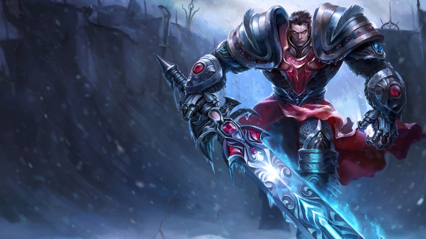
I don't know, this skin has always just bugged me. Yes yes I understand that it's a free skin, (obtainable by following League of Legends on twitter, do it, it's free!) I just never really could get into this skin, it really just hearkens back to a lot of the people I went to high school with, who were so into the DARK AND EDGY stuff. I'm so past that now that when I'm reminded of it, I get second-hand embarrassment. This skin is a lot of that. It's not a fun dark skin like Goth Annie, it's just teen angst Garen. He's clearly mad at the world for some indiscernible reason so he donned his dark scary armor and put a a scowl on his face. Not to mention, that skin in-game is just kind of lame. It's nothing super special, doesn't have any new particle effects and just seems like a random skin dumped out just for it's own sake. I just never really liked it. The only plus is that the original splash art for it was worse than it is now, but that's not really a reason to like it. It's just a reason to have it be #10 and not #5.
#9 - Exiled Morgana
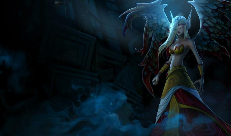
Now Morgana had a skin that ALMOST made the top ten best skins, but I cut it at the last minute, so the fact that she's on the top ten WORST skins is remarkable, she was almost on both! Now the deal with this skin is much simpler than the previous skin, it's just that it really hasn't aged well. It's basically just a boring recolor of the regular Morgana skin, but with an ugly, poorly aged splash art. Not really much else to say really, it's just blahh.
#8 - Commando Lux
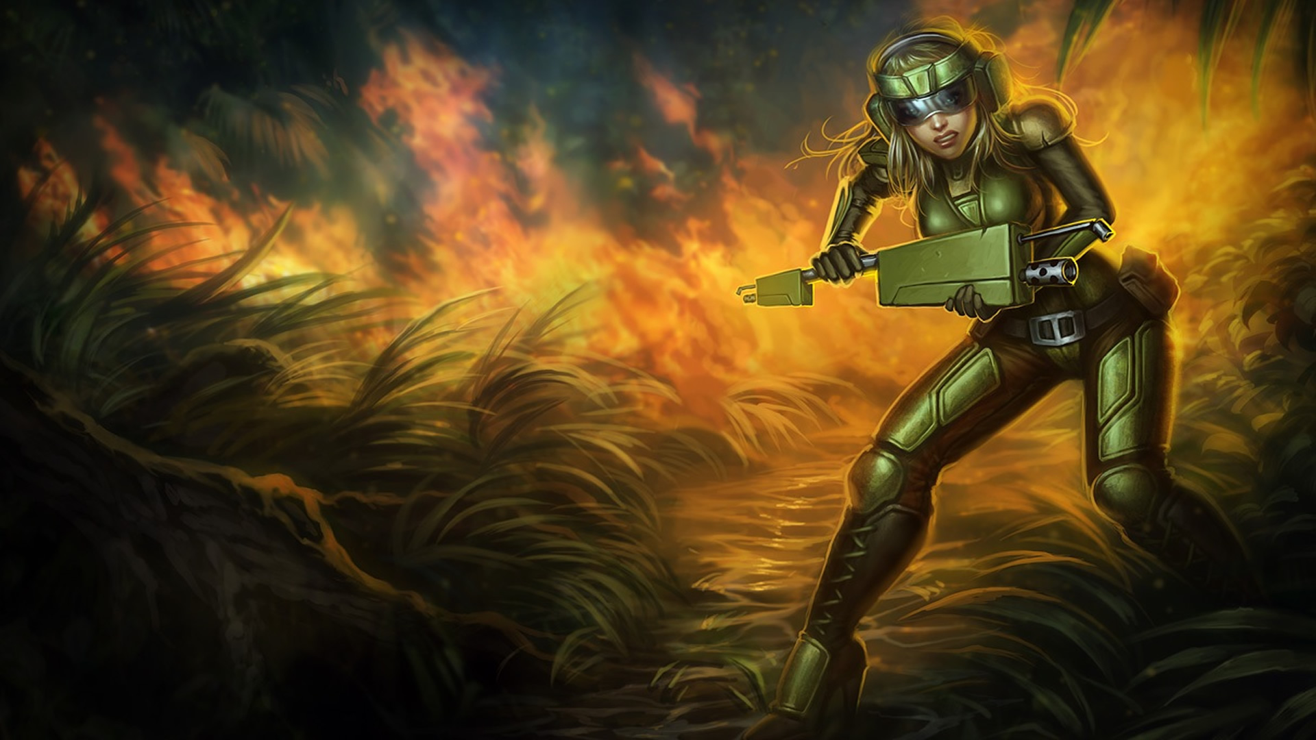
This skin is just ugly. It's ugly in-game and that splash art is atrocious. Her hair is bad, her weapon is stupid. The list goes on. Now I've never been a fan of any of the commando skins, but at least most of them have semi-humorous and/or cool designs to them and a couple are subtle pop culture and gaming references which I really appreciate, but Lux's is just bland and ugly. It's like they made a set of skins and were just like, "Oh no, we didn't have a girl!" and they threw an ugly, poorly made costume on Lux, glued some god-awful cosplay nightmare weapon together and gave it to her and called it a day.
#7 - Infiltrator Irelia
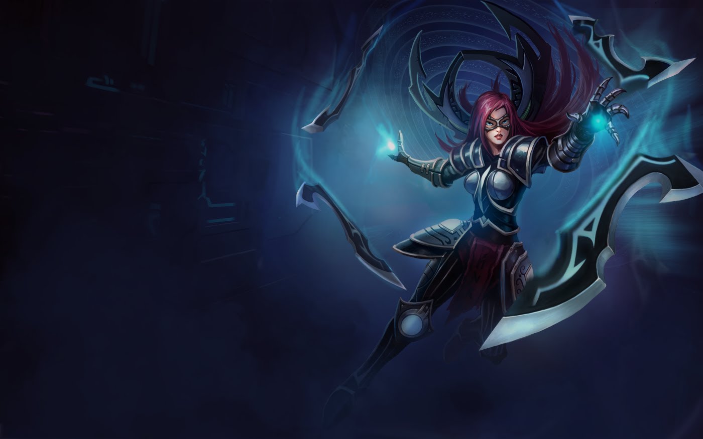
Continuing my trend of horrible female champion skins, we come to #7: Infiltrator Irelia. The hair's wrong, the mask is ugly and tacky, the weapon skin is uninteresting and the outfit just looks like a weird, cheap mess. This skin's splash art is also ugly as sin, and the in-game model isn't much better, also, no new particle effects as usual and it's just a bland concept. What's she infiltrating? Who is she posing as? Why is she trying to infiltrate something while using her signature weapon that only she uses, therefore making any attempts at disguising herself pointless? There's so many unanswered questions, this skin just kind of seems lazy and bland, moving on.
#6 - Galactic Renekton
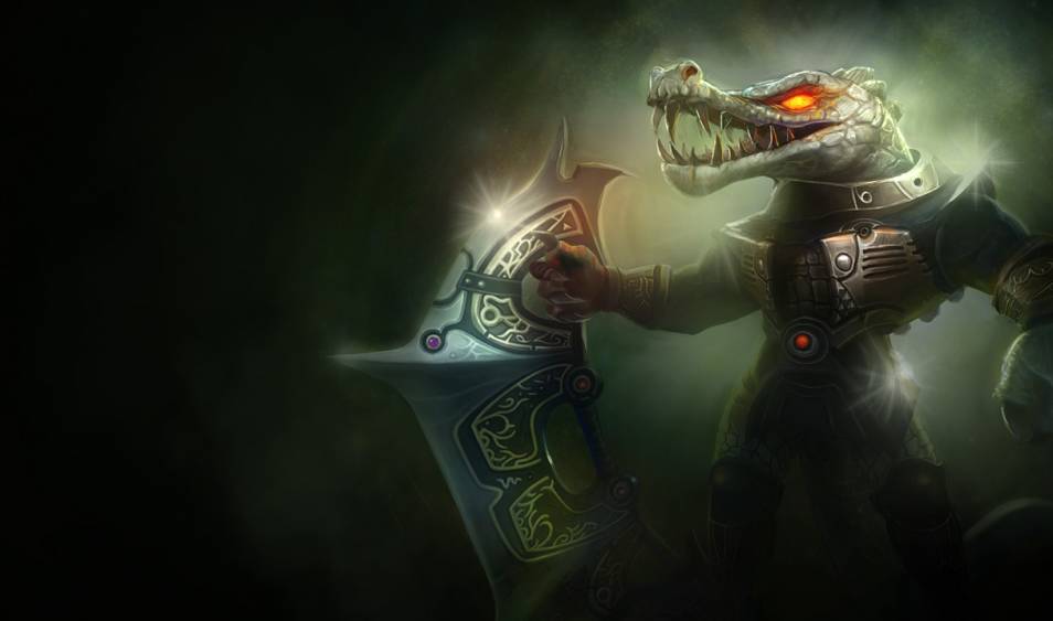
Now the rest of the Galactic skins were pretty bad, but this one takes the cake. They turned the egyptian-style crocodile-god-thing into some albino crocodile in a poorly constructed Battlestar Galactica cosplay made by a drunk guy who has only ever seen the commercial. His weapon is just kind of uninteresting. I really feel like they could have gone all the way with this skin and made him a full-on cyborg spaceman-dile. It's really a missed opportunity, and boy did it miss. Poor Renekton.
#5 - Prototype Viktor
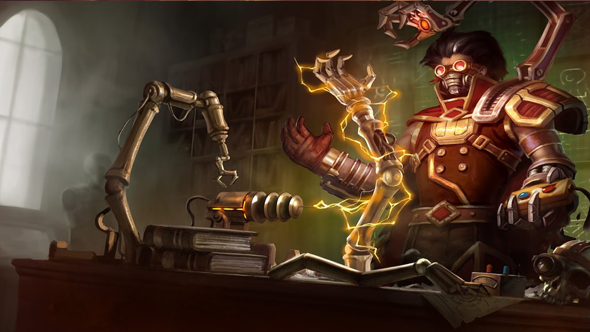
This skin is just a mess. I understand, it's supposed to be him before he was completely cyborg-ified, which is a word by the way, don't question my authority. It just could have been pulled off a lot better. His hair looks bad, his goggles look dumb, his robot-hand-thingie isn't really interesting and his outfit just doesn't stand out. Kassadin has a much better 'pre-transformation' skin, and this one just doesn't do it for me. On top of all of this, the splash art hasn't aged very well, it's aged better than Exiled Morgana, but it's still pretty bad.
#4 - Undertaker Yorick
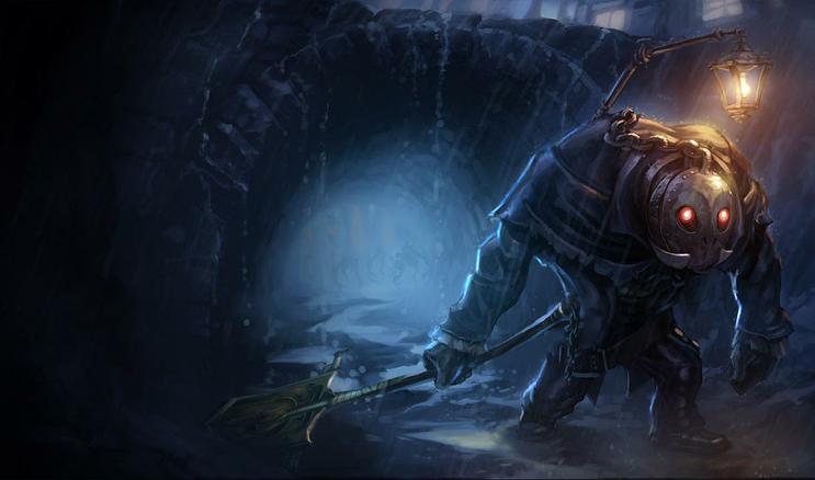
Yorick actually exists? What? Anyway, this skin confuses me, honestly. It looks like a ten year old's homemade Big Daddy costume for Halloween. It doesn't look like an undertaker at all. The lantern, while semi-amusing, just adds to the confusion. It's not intimidating, it's not cool, funny or cute. It just doesn't hit any notes whatsoever. His shovel looks more like some sort of medieval banner on a stick than a shovel. Literally nothing about this skin makes any sense, which can sometimes be a good thing, but it all comes together in a way that you can't even laugh at very much. Riot, please.
#3 - Ravager Nocturne
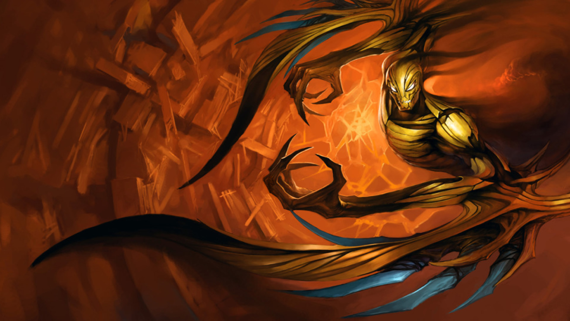
Speaking of things all coming together poorly, what is this? Golden Spiderman Villain Nocturne? The slash art is one of the ugliest in the game, and the in-game model is pretty bad too, even after Nocturne's semi-recent texture re-balance, this skin's re-balance was so half-assed that it makes it look almost worse than before because his other skins look even better now in comparison than they did before. This skin isn't cool like it was clearly intended to be, and it just kind of became a weird mess of lines and looks like some sort of abstract art piece. It also doesn't evoke any real thought or interesting emotion besides nausea like an art piece should, it just missed the mark on all levels. The colors are bad, the splash art is bad, the model is bad. I love you Riot, but this skin is an abomination.
#2 - Crimson Elite Riven
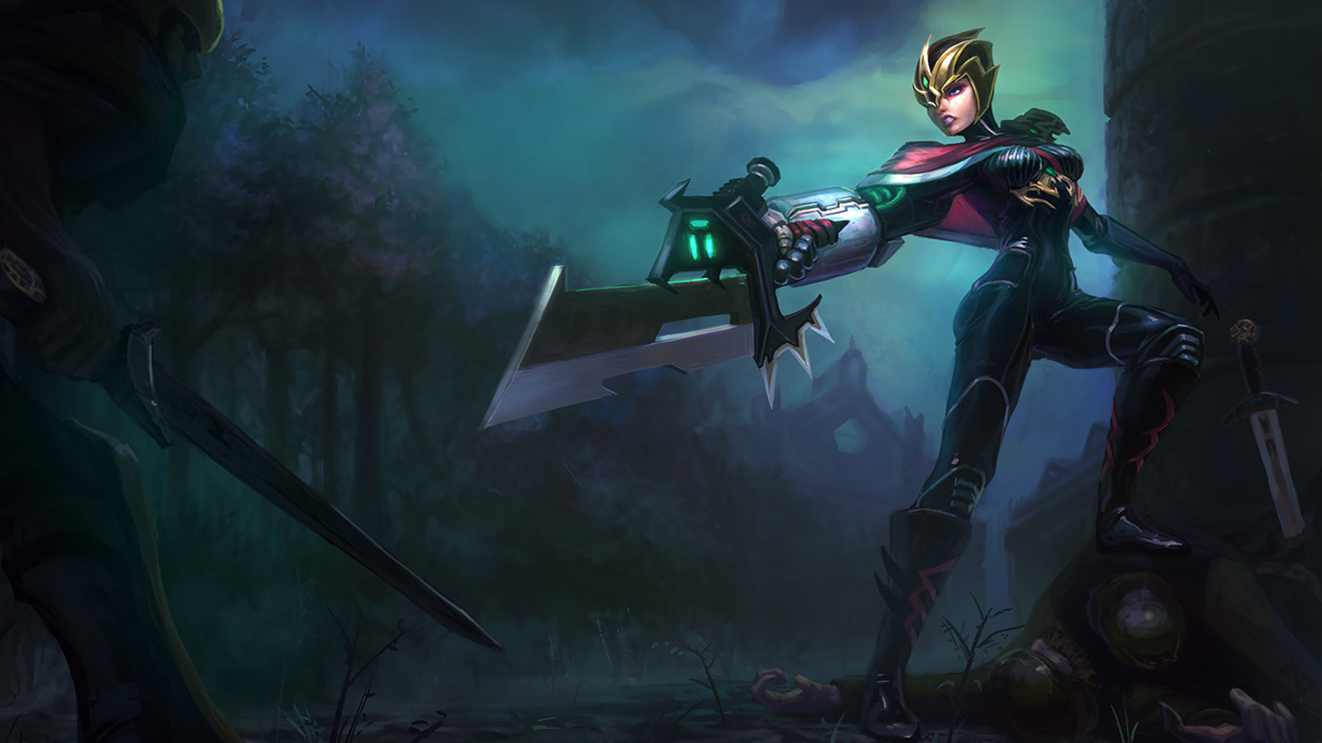
Also speaking of abominations, we come to #2. Now this skin is an interesting concept. Riot clearly sat down as was like, "You know what's a good idea? Let's take one of our most popular and prettiest female champions and make her ugly as sin and make no sense. Good idea? Good idea." I honestly just can't understand this skin. It's so disjointed and full of random influences and colors I just can't even figure out what it's supposed to be. It's like Riven who, while not really knowing or caring that she's pretty, just fell onto a rack at the costume store, looked in the mirror, saw how hideous she looked and walked out with her partially medieval, partially power ranger, smeared makeup mess and went on her way. Her sword doesn't look broken like it's supposed to, it just looks like a short, fat blade that somehow ends up looking like it's from a bad sci-fi convention. Her in-game model somehow managed to be even uglier, if that's even possible. I just can't with this skin. I just can't.
And now we've come to the worst of the worst, get your barf bags ready, shield your children's eyes and remember, Slashskill isn't liable for any corneal damage you may suffer from viewing this horrid mess.
Are you ready?
Sure?
Absolutely sure?
You can turn back anytime.
Actually you can't, I need my readership.
Anyway, somebody hold me, here we go.
#1 - Crimson Elite Talon
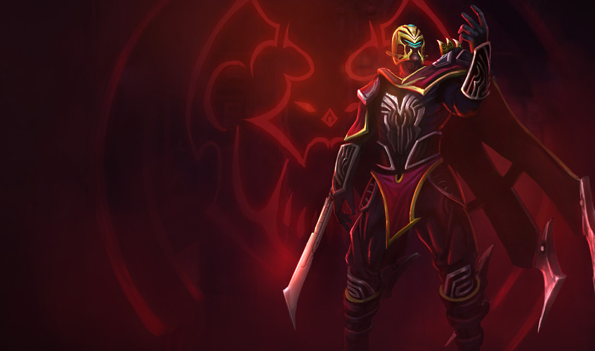
This skin. THIS. SKIN. It is literally awful, it checks every bad box. What is it supposed to be? What's it referencing? Why is it so ugly? What is that helmet? Why is it Crimson Elite Riven on steroids? Clearly the Crimson Elite set of skins was a flop, because they make no sense, are full of random colors splatted on a disorganised mess of a design, they have TERRIBLE splash arts and their in-game models are horrendous. The only reason that this is worse than Riven's is purely due to the fact that you can sort of see how people might like Riven's. Most notably that she has a hilarious bubble ass in that skin. But this skin offers nothing, it doesn't follow Talon's style at all, and it doesn't add anything new to the character or express any part of his personality. Not to mention it's big and clunky which makes no sense considering he's a fast, stealthy assassin type of guy. Is he supposed to be some sort of hellish demon lord or something? I have actually no idea what's going on here. This skin was supposed to be... Actually, I can't even finish that statement, because it has absolutely no clear message here. In-game it's awful too, which of course is the only part that makes sense here.
Riot. My nightmares will forever be haunted by these skins, and now, without further ado, I'm going to sign off and cry myself to sleep.
Toodles!
~Bazzlie
